Build a Live xG Timeline in 5 Steps for Analysts, No Spreadsheets
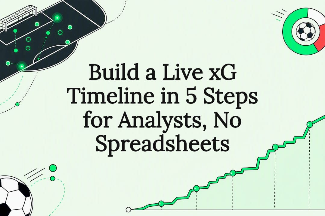
An xG timeline plots cumulative expected goals for both teams across a match, minute by minute, so the shape of chance quality becomes visible instead of buried in a post-match stat sheet. Penalties and own goals are typically stripped out of the cumulative total, and per-possession adjustments correct for multiple shots crowding the same passage of play. Analysts use it three ways: as a live momentum read, as an in-play betting signal, and as the backbone of post-match and season-long narrative.
TL;DR:
- A steep slope on the xG timeline indicates sustained high-quality chance creation, but checking if it results from one big shot or multiple moderate ones is crucial for interpretation.
- Excluding penalties and own goals from cumulative xG totals ensures the chart accurately reflects chance quality rather than chance conversion likelihood.
- High cumulative xG with few goals suggests poor finishing, while low xG with many goals indicates luck or low-probability strikes benefiting the scoring team.
- Building an accurate xG timeline requires careful handling of timestamps, per-possession adjustments, and calibration, especially when shots occur in quick succession.
- Betsyscore delivers real-time xG timelines during matches, providing live momentum reads and win probabilities that assist in betting and tactical analysis.
Table of Contents
- What an xG Timeline Shows: Components and Common Variants
- How to Read an xG Timeline: Momentum, Spikes and Divergence
- Constructing an xG Timeline from Event or Shot Feeds: Steps and Pitfalls
- Visualization Best Practices and Implementation Examples
- Practical Use Cases: In-Play Betting, Post-Match Narrative and Season Tracking
- How Betsyscore Puts xG Timelines to Work on Every Match Page
- Reading the Timeline Without Overreading It
- Get Live xG Timelines and Momentum Reads on Betsyscore
- Primary Sources and Further Reading
- Sources
- FAQ
What an xG Timeline Shows: Components and Common Variants
A standard xG timeline is a step chart. Each team gets its own line, climbing in stair-step increments every time a shot adds expected-goal value. Goals get their own markers, usually annotated with the scorer and the running score, and vertical lines split the chart at halftime and full time.
The chart family branches out from there:
- Match race chart: the classic cumulative xG line for both teams across 90 minutes, the version most fans picture when they hear “xG timeline.”
- Net-xG-per-interval bars: a diverging bar panel beneath the main line showing which team created more danger in each five- or ten-minute window, useful for spotting short bursts of pressure the cumulative line smooths over.
- Season-level rolling or per-90 timelines: instead of minutes, the x-axis becomes match number or gameweek, tracking whether a team’s xG per 90 is climbing, holding steady, or falling off.
Most serious implementations also separate non-penalty xG (npxG) from the full total. Penalties convert at a rate close to certainty regardless of shot quality elsewhere on the pitch, so folding them into a chance-quality chart flattens the very signal the timeline is built to show. Own goals get the same treatment since they say nothing about the scoring team’s process.
How to Read an xG Timeline: Momentum, Spikes and Divergence
Slope is the first thing to check. A steadily climbing line means a team is generating chances at a consistent rate, the sign of sustained control rather than a lucky sequence. A sharp vertical jump, by contrast, marks a short burst, maybe a corner cluster or a five-minute spell of sustained pressure, that inflates the total without reflecting the wider match.
Divergence between the line and the scoreline is where the timeline earns its keep:
- High cumulative xG, few actual goals: chance quality was there, but finishing let the team down, or the goalkeeper had an outstanding night.
- Low cumulative xG, goals on the board: the scoring team got fortunate, benefited from a defensive error, or scored from a low-probability strike that the model correctly rated as unlikely.
- A flat line late in the match: a team sitting on a lead has usually stopped creating and shifted into a defensive shape.
Watch the recent delta, meaning xG accumulated in just the last five to ten minutes, alongside the net-xG-per-interval bars. That combination catches a momentum swing before the cumulative line has fully caught up. None of it works in isolation, though. A red card, a tactical substitution, or a team going a goal down changes what the rest of the timeline means, so game state always has to sit next to the chart in your head.
Pro Tip: If a team’s cumulative xG jumps sharply in a five-minute window, check whether it came from one high-value shot or several moderate ones. One big chance skews the read far more than sustained pressure does.
Constructing an xG Timeline from Event or Shot Feeds: Steps and Pitfalls
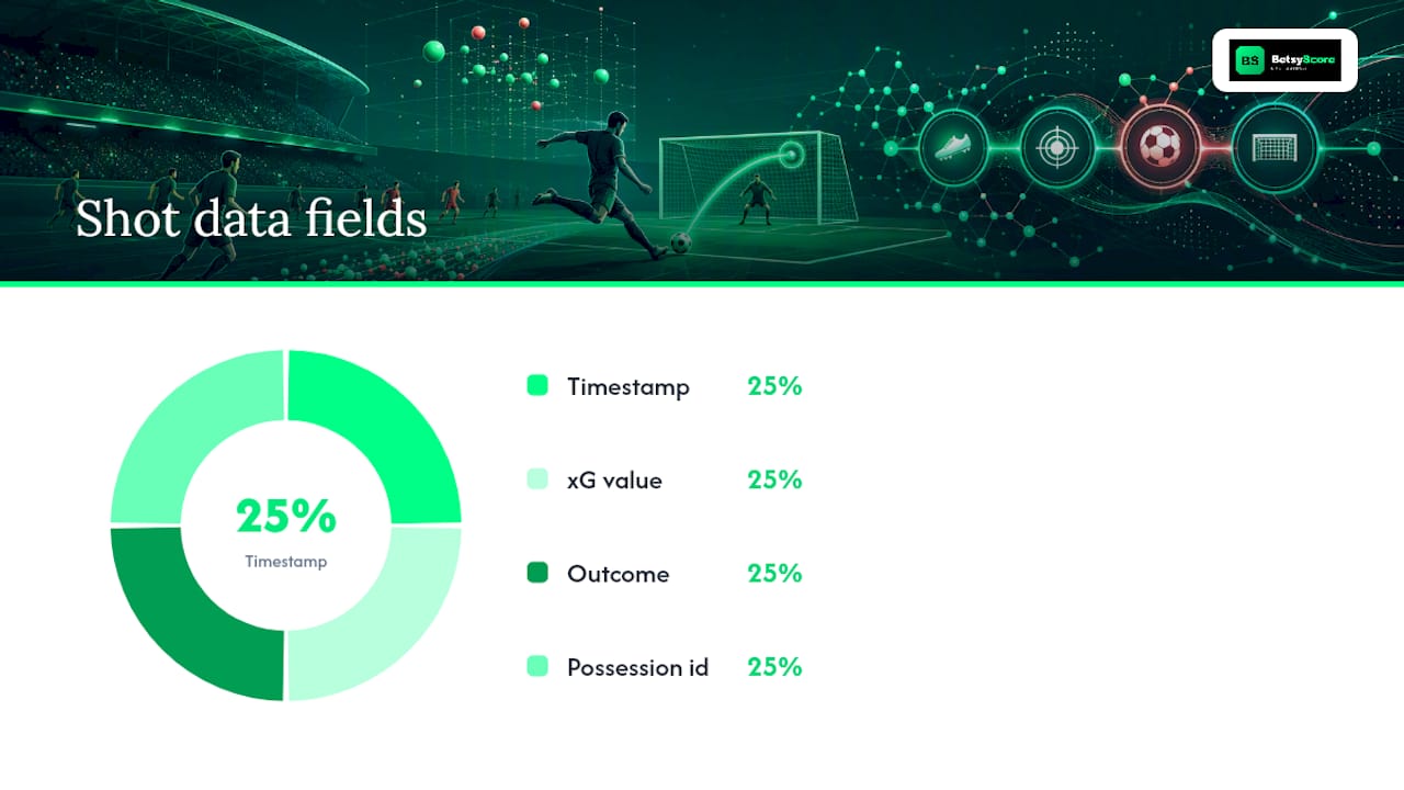
Building one from raw data takes four ingredients per shot: a timestamp down to the minute and second, the shot’s xG value, its outcome, and a possession identifier. Feeds structured like the soccermatics implementation, which processes StatsBomb-formatted event data, make this straightforward because the schema already carries all four fields.
The build itself follows a repeatable sequence:
- Convert period time to continuous match time. Second-half timestamps restart from zero in most raw feeds, so they need an offset before plotting makes sense.
- Add dummy start and end rows. A cumulative line needs a zero point at kickoff and a closing point at full time, or the step chart looks truncated.
- Zero out penalties and own goals in the cumulative running total, while still logging them as goal markers on the chart.
- Handle same-second shot clusters. When two shots land in the same possession within the same minute, either offset their timestamps by fractions of a second to preserve order, or apply a conditional-probability adjustment across the possession so the second shot’s value reflects that the first one already failed.
- Recalibrate the underlying model whenever the match set changes, checking calibration band by band rather than trusting an aggregate total that can mask errors within specific distance ranges.
The conditional-per-possession adjustment matters more than it sounds. Two shots from the same buildup do not carry independent probabilities; the second only happens because the first missed. The soccermatics documentation builds this adjustment directly into its plotting function, redistributing xG within a possession instead of letting it stack additively.
The most common pitfall is treating minute-level granularity as good enough for volume analysis. Aggregating everything to whole minutes hides the order of events inside a scramble, and skipping the penalty/own-goal exclusion step distorts total chance-quality figures for the whole match. Calibration drift is the quieter trap: the Forensics-xG project notes that checking calibration by shot-distance band catches systematic bias an aggregate sum would never reveal.
Visualization Best Practices and Implementation Examples
Readable xG timelines follow a short set of rules. Step lines, not smoothed curves, since expected goals accumulate in discrete jumps at the moment of each shot. Team colors carried consistently from the scoreboard to the chart. Goal markers labeled with scorer and running score. Vertical lines at halftime and full time, with enough y-axis buffer above the highest line that a late spike doesn’t clip the frame.
- A small diverging bar panel underneath the main line, showing net xG per five-minute interval, catches short pressure bursts that the cumulative line smooths away.
- Cumulative views work best for single-match storytelling; per-interval bars work best for spotting momentum shifts; rolling per-90 metrics work best for season-length questions.
- The soccermatics soccerxGTimeline function, built in R with ggplot2, remains one of the clearest open-source references for this exact chart type, and its source code shows the preprocessing and annotation logic in full.
A shot map pairs naturally with a timeline. One shows where the danger came from; the other shows when.
Practical Use Cases: In-Play Betting, Post-Match Narrative and Season Tracking
The most direct application is projecting remaining match goals while a game is live.
- Calculate the observed rate: divide cumulative xG by elapsed minutes.
- Project forward: multiply that rate by minutes remaining to estimate additional expected xG.
- Apply a Poisson estimate to that projected figure to gauge the probability of at least one more goal, a method worked-example betting guides walk through step by step.
Post-match, the same chart separates finishing variance from actual chance creation, credits the players generating danger through expected assists, and flags a defense conceding from low-probability positions as unlucky rather than exposed. Season-level, rolling or per-90 xG tracking shows whether a hot streak is sustainable or due for regression. All three uses share the same weakness: small samples, in-game tactical shifts, and red cards can distort a projection built on a handful of shots.
How Betsyscore Puts xG Timelines to Work on Every Match Page
The platform builds minute-by-minute momentum reads and win probabilities from expected goals, recent form, and head-to-head data. Match pages combine live lineups, instant stats, cumulative xG visuals, a goalkeeper-adjusted PSxG metric, and xP context, covering more than 200 competitions without requiring readers to build any of it themselves.
Reading the Timeline Without Overreading It
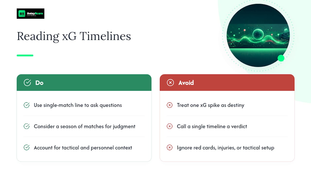
One match tells you what happened. A season of matches tells you what a team actually is. That distinction gets lost every time a pundit points at a single cumulative xG spike and calls it destiny.
The instinct to treat one timeline as a verdict is the biggest misuse I see. Chance quality still needs tactical and personnel context, a red card, an injury, a manager parking the bus at 1-0, before it means anything. Use the single-match line as a prompt to ask questions, not as the answer itself.
— Aria
Get Live xG Timelines and Momentum Reads on Betsyscore
Building a calibrated xG timeline from raw shot feeds takes real work: continuous time conversion, per-possession adjustment, band-by-band recalibration. This platform delivers the finished chart the moment kickoff happens. Every covered match gets a live, minute-by-minute momentum read built from the same underlying expected-goals data described above, updated as the game unfolds rather than reconstructed after the fact.

Head to Live now during any covered fixture to watch the cumulative xG lines move in real time, or check AI Predictions before kickoff for win-probability figures built from the same expected-goals foundation. Both are free to open, and neither requires spreadsheets.
Primary Sources and Further Reading
- soccermatics soccerxGTimeline documentation and its source implementation
- Forensics-xG: The World Cup Files for calibration notes
- Sportmonks Football Pressure Index for pairing pressure with xG
Sources
- soccermatics::soccerxGTimeline documentation
- soccermatics soccerxGTimeline implementation (source)
- Forensics-xG: The World Cup Files
- Football Pressure Index | Match Intensity Data | Sportmonks
- Practical xG and shot-quality methods for over/under betting - GG Bettings
FAQ
What Does a Steep Slope on an xG Timeline Mean?
A steep slope means a team generated high-value chances quickly, either from sustained pressure or one dangerous sequence, and checking whether it came from one shot or several helps tell the two apart.
Why Are Penalties Excluded from Cumulative xG Totals?
Penalties convert at a probability far higher than open-play shots, so including them would distort the chance-quality signal the timeline is meant to isolate.
Can I Use an xG Timeline to Predict the Final Score?
Not reliably. It can help project additional expected goals using rate and Poisson-based estimates, but tactical shifts, red cards, and small sample sizes limit how far that projection can be trusted.
Does Betsyscore Show Live xG Timelines During Matches?
Yes. Betsyscore’s live match pages update momentum reads and cumulative xG visuals minute by minute as covered fixtures unfold.
What Is the Difference Between xG and npxG on a Timeline?
xG includes every shot type, including penalties, while npxG (non-penalty xG) strips penalties out to give a cleaner read on open-play chance creation.