Shot Map Soccer Guide: Read, Plot, and Present Data
A shot map is a half-pitch diagram that plots every attempt by location, sizes each dot to its expected goals (xG) value, and marks the outcome with a distinct fill or outline. The fastest way to build one: pull event data with x,y coordinates, run it through an xG model, and render it with a plotting library like mplsoccer or a browser tool that computes xG automatically.
Getting from raw event data to a coach-ready graphic takes three moving parts working together.
- Data: shot coordinates, body part, shot type, and result for every attempt in a match or season.
- A model: an xG value assigned to each shot, ranging from a tap-in near 1.0 to a speculative strike from 40 yards near 0.02.
- A renderer: mplsoccer, a browser-based click-to-plot tool, or a platform export like Hudl’s Shot Map, which already bundles xG, Post-Shot xG (PSxG), and outcome filters into one interface.
Key Takeaways
Reading and building a soccer shot map correctly requires understanding xG-driven size encoding, provider-specific coordinates, and PSxG for finishing evaluation.
| Point | Details |
|---|---|
| Definition first | A shot map plots every attempt by location, sizes dots by xG, and marks outcome by fill or outline. |
| Check coordinates before plotting | Confirm whether your data uses StatsBomb’s 120x80 grid or a percentage-based system before rendering. |
| Dot size isn’t finishing quality | Use Post-Shot xG (PSxG), not location xG, when evaluating how well a player actually finishes chances. |
| Isolate one variable per view | Separate open play from set pieces and show one tactical question per graphic for coaches. |
| Pick tools by workflow need | Use mplsoccer for reproducible code, browser tools like DrawTactics for speed, or Hudl for team-integrated reports. |
Table of Contents
- What a Shot Map Actually Shows You
- How to Read a Shot Map: Visual Encodings Explained
- Where Shot Data Comes From and How Coordinates Work
- The Tools Analysts Actually Use to Build Shot Maps
- Building Your Own Map: A Runnable mplsoccer Example
- Turning a Map Into a Coaching Decision
- Getting Your Shot Map From Screen to Sideline
- How I Use Shot Maps in Real Match Prep
- Sources
- FAQ
What a Shot Map Actually Shows You
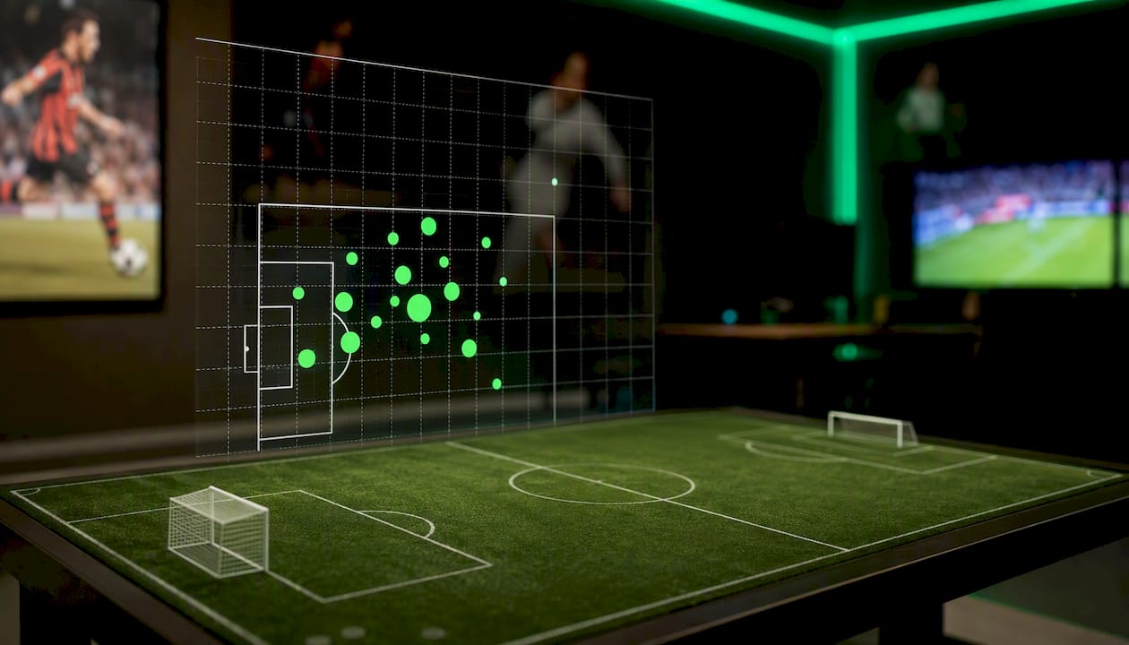
A shot map, sometimes called a shot chart, plots discrete attempts on goal as dots positioned at their real pitch location. Each dot usually carries two more layers of information: size for xG and fill or outline for outcome. That’s different from a full-pitch heatmap, which shows general zones of activity rather than individual attempts, and different from a shot density map, which smooths shot locations into contour bands instead of showing each shot as a distinct point.
Analysts reach for shot maps in a handful of recurring situations:
- Post-match reports that summarize a game’s chance quality in one glance.
- Player shot diet analysis, showing where a striker actually gets his looks versus where a coach wants him shooting from.
- Opponent scouting, revealing whether a team leans on crosses into the box, cutbacks, or long-range efforts.
- Season aggregation, tracking whether a team’s chance creation is trending up or collapsing over a run of games.
The underlying data comes from event providers that log every touch, pass, and shot with a timestamp and coordinate. American Soccer Analysis’s shot-location work shows how aggregated shot distributions expose tactical identity at a league level, not just a single game.
How to Read a Shot Map: Visual Encodings Explained
Every well-built shot map follows the same visual grammar, even when the color scheme changes. Learning it once means you can read almost any provider’s chart without a legend.
- Position: the dot sits at the exact x,y coordinate where the shot was taken.
- Size: larger dots mean higher xG, so a penalty dot dwarfs a hopeful strike from distance.
- Fill or outline: a solid fill usually marks a goal, a hollow or outlined dot marks a save, block, or miss.
- Color or shape: distinguishes shot type, separating headers from footed shots, or open play from set pieces.
Hudl’s shot-map documentation confirms this is the standard convention across professional platforms: xG drives size, outcome drives fill state, and filters let you isolate game state or shot type on demand. When you’re choosing your own palette, ColorBrewer remains the reference point for color schemes that stay readable for colorblind viewers and hold up in print.
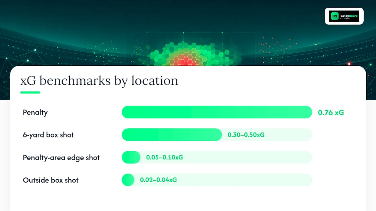
Some rough xG benchmarks help you sanity-check any map you’re reading. A penalty sits around 0.76 xG, a shot from the edge of the six-yard box lands somewhere between 0.30 and 0.50, an effort from the edge of the penalty area falls to roughly 0.05 to 0.10, and anything struck from outside the box usually drops to 0.02 to 0.04, according to KiqIQ’s shot-map explainer.

The biggest misread analysts make: treating dot size as a proxy for finishing quality. It isn’t. Dot size reflects the chance, not what the player did with it. That’s exactly why Post-Shot xG exists as a separate metric. PSxG factors in shot trajectory and whether the effort was on target, which lets you compare a player’s actual finishing against the chance he was given, according to an analysis of post-shot xG’s role in player evaluation. A player who consistently outscores his location-based xG but not his PSxG may just be facing bad goalkeeping, not proving he’s a clinical finisher.
Sample size is the other trap. A single match’s shot map can look dramatic purely by chance. Season aggregates smooth that noise out but can hide tactical shifts mid-year, so always check the date range before drawing conclusions.
Pro Tip: When presenting to a coaching staff, isolate one variable per map. Show open-play shots alone, then set pieces alone. A combined view with both shot types and three outcome states crammed onto one pitch is unreadable in a five-minute team meeting.
Where Shot Data Comes From and How Coordinates Work
Shot data originates from event providers who log every attempt with a coordinate pair, a body part, an assist type, and a result. The three names you’ll encounter most often are StatsBomb, Opta (now under Stats Perform), and Wyscout, alongside open community data dumps that give hobbyist analysts a way in without a commercial license.
Coordinate systems vary by provider, and this trips up more analysts than any other technical detail. StatsBomb uses a 120 by 80 pitch grid with the origin in the top-left corner. Opta traditionally scales to a 100 by 100 system regardless of a stadium’s actual dimensions. Some tools work in half-pitch coordinates only, since every shot map, by definition, only needs the attacking half.
Before plotting anything, confirm which system your data uses and convert if you’re mixing sources. Rescaling a percentage-based system into meters is a one-line multiplication, but skipping it silently shifts every shot on your map.
xG models themselves draw on a consistent set of inputs: distance to goal, shot angle, body part, assist type, and increasingly, freeze-frame data showing where defenders and the goalkeeper stood at the moment of the shot. Research from KU Leuven’s sports analytics group found that models incorporating freeze-frame positioning produce meaningfully different, and generally more accurate, xG values than location-only models. That’s worth knowing before you compare xG totals across two different data providers. They’re rarely using the same inputs.
For clean plotting, keep your schema minimal: x, y, body_part, shot_type, result, and an xG value. Penalties and direct free kicks should carry a flag so you can filter them out when you want an open-play-only view.
The Tools Analysts Actually Use to Build Shot Maps
Your choice of tool depends on how much control you need versus how fast you need a finished graphic.
- Browser-based click-to-plot tools like DrawTactics let you place a shot on a pitch diagram and get an instant xG calculation, with PNG and CSV export built in. Good for a quick pre-match brief when you don’t need reproducible code.
- mplsoccer is the standard Python library for pitch plotting. It handles pitch drawing, coordinate scaling, and scatter styling in a few lines, and it’s the tool Soccermatics uses in its own plotting tutorials.
- Soccermatics itself is less a tool and more a teaching resource. Its documentation walks through exactly how to take raw x,y data and metadata and turn it into a reproducible chart, which makes it the best on-ramp if you’re new to Python plotting.
- American Soccer Analysis publishes its own shot-location research and public-facing visualizations, useful both as a data reference and as a model for how league-level aggregation reveals tactical patterns.
- StatsBomb supplies the underlying event data that powers a huge share of public and commercial shot maps, plus its own viewer tools for browsing match data directly.
- Observable hosts d3-based interactive xG map examples that add tooltips and dynamic filtering, a good reference if you’re building a web dashboard rather than a static export, according to Pieter Robberechts’s xG map project.
- Hudl rounds out the list as the platform most team analysts already use daily. Its Shot Chart Report bakes xG coloring and shot-type breakdowns directly into the team workflow, no coding required.
Building Your Own Map: A Runnable mplsoccer Example
Here’s the practical path from a spreadsheet of shots to a finished PNG.
- Prepare an event CSV with columns for x, y, body_part, shot_type, and result.
- Convert coordinates to a single system if your data mixes providers.
- Calculate distance and angle to goal from each x,y pair.
- Apply an xG value, either from a provided model or a simple logistic function based on distance, angle, and body part, similar to the approach RenderFoot’s xG calculator uses.
- Map xG to circle size and set fill color by outcome (solid for goals, hollow for everything else).
- Render with mplsoccer’s Pitch class and export as PNG or SVG.
A minimal sample row looks like this: x=102, y=40, body_part=foot, shot_type=open_play, result=goal. Under a StatsBomb-style 120x80 grid, that’s roughly 18 yards out and central, an xG value that should land somewhere around 0.25 to 0.35 depending on the model.
A basic mplsoccer script follows this shape:
from mplsoccer import Pitch
import pandas as pd

pitch = Pitch(pitch_type='statsbomb', half=True)
fig, ax = pitch.draw()

for _, shot in shots_df.iterrows():
    color = 'green' if shot['result'] == 'goal' else 'none'
    pitch.scatter(shot['x'], shot['y'], s=shot['xg'] * 500,
                  facecolor=color, edgecolor='black', ax=ax)
Pro Tip: If your dots all show up in the wrong half or clustered oddly near a corner, check for inverted y-axis conventions first. That single flip is the most common bug analysts hit when switching between providers.
Keep your package versions noted somewhere. mplsoccer updates its API periodically, and a script that works today may need a small tweak after an upgrade.
Turning a Map Into a Coaching Decision
A shot map alone tells you where attempts happened. It doesn’t tell you why a shot went in or why a goalkeeper got beaten, which is exactly why Hudl’s documentation stresses pairing shot data with video or freeze-frame evidence before drawing tactical conclusions.
A few filtering habits separate a useful map from a confusing one:
- Split open play from set pieces. Combining them muddies both patterns.
- Report rates per 45 or per 90 minutes rather than raw counts, especially when comparing players with different minute totals.
- Use rolling windows, like a trailing five or ten matches, to catch form changes before a full-season number would show them.
Pairing a shot map with a pass map or expected-assists data explains how a chance was created, not just where it landed. And when you’re judging a striker’s finishing rather than his chance creation, lean on PSxG instead of raw location-based xG, since PSxG accounts for whether the shot was actually on target.
Presentation discipline matters as much as the data itself. DrawTactics’s own design guidance recommends isolating one tactical question per slide rather than layering everything into a single crowded view. One graphic, one takeaway, one suggested adjustment.
Pro Tip: Build a “coach-ready” export that pairs the visual with a single sentence, like “Their left-back is conceding six-yard-box chances from crosses,” followed by one concrete drill or tactical tweak. Coaches act on sentences faster than they act on scatter plots.
Getting Your Shot Map From Screen to Sideline
The right export format depends on where the map is headed. PNG works for a printed handout or a slide deck. SVG keeps the graphic editable if you need to tweak colors or labels later. CSV lets a downstream analyst rebuild the chart or run further calculations. Interactive HTML, built with something like Observable’s d3 examples, suits a web dashboard where a viewer might want to filter or hover for detail.
Annotation should stay light. A minimal legend, one highlighted shot or cluster you want the room to notice, and a short written takeaway beat a pitch covered in labels and arrows. Hudl’s sample shot-chart exports show how restrained the best platform-generated graphics stay, usually just dots, a simple legend, and clean pitch lines.
For delivery, match the format to the moment. A pre-match brief calls for one or two static images with a headline takeaway. A full post-match report can afford more detail, multiple filtered views, and a CSV attachment for anyone who wants to dig further. If your workflow already touches live match stats during a game, pairing that real-time context with a post-match shot map gives the fullest picture of how a result actually happened.
How I Use Shot Maps in Real Match Prep
Scouting an opponent usually starts with three maps side by side: their shots for, their shots against, and a set-piece-only view. That third map alone often tells you whether a team is vulnerable from corners before you’ve watched a single clip.
Prepping a lineup means pulling up a player’s individual shot diet, not the team’s. A striker who scores well but shoots mostly from the edge of the box is a different tactical problem than one who gets into the six-yard box regularly but finishes poorly. The map alone can’t tell you which is happening. That’s a PSxG question, and it usually means pulling actual video of the low-value attempts to see if a service problem is to blame or if the finishing genuinely needs work.
The choice between half-pitch and full-pitch views comes down to the question you’re answering. Half-pitch keeps a single team’s attacking pattern uncluttered. Full-pitch matters more when you’re studying transition moments, since a counterattack’s shot often connects back to where possession was won.
One thing I’ve learned to be blunt about with coaches: a shot map is a probability snapshot, not a verdict. A team can generate excellent chances and lose, or scrape by on three shots. Presenting the map with that uncertainty stated plainly, rather than implying the numbers predict the result, keeps the room’s trust intact for the next report.
Betsyscore’s live scores and momentum tracking give you that real-time complement to post-match shot analysis, useful when you want to see how a match’s shot pattern lined up with the actual run of play as it happened. For forward-looking prep, Betsyscore’s AI-powered match predictions build on the same underlying signals, expected goals, recent form, and head-to-head history, that feed the shot maps you’re already reading.
Sources
A handful of references cover most of what you’ll need to go from reading a shot map to building your own pipeline.
- Match Shot Map • Hudl Support
- Plotting shots — Soccermatics documentation - Read the Docs
- Football shot maps explained: How to read them like an analyst — KiqIQ
FAQ
What Is a Shot Map in Soccer?
A shot map is a half-pitch diagram plotting every shot attempt by its real location, with dot size showing xG value and fill or outline showing whether it was a goal, save, block, or miss.
What’s the Difference Between xG and PSxG on a Shot Map?
xG measures a chance’s quality based on location and situation before the shot is taken, while Post-Shot xG (PSxG) adjusts for shot trajectory and accuracy, making it the better metric for judging finishing ability.
Which Tool Should I Use to Build a Shot Map?
Use mplsoccer if you want reproducible Python code, a browser tool like DrawTactics if you need a fast no-code export, or a platform like Hudl if your team already manages reports there.
Why Do Shot Maps From Different Providers Look Different?
Providers like StatsBomb and Opta use different coordinate systems and pitch scales, so a map built from one provider’s data needs conversion before it will match another provider’s layout.
Can a Shot Map Alone Tell Me If a Team Played Well?
No. A shot map shows chance location and quality but not context like defensive pressure or finishing execution, which is why analysts pair it with video or freeze-frame data before drawing conclusions.