When Event Maps Mislead: Player Heatmaps for Coaches and Analysts

A player heatmap is a color-coded visualization showing where a player spent time or performed actions during a match, and coaches use it to check positioning, tactical adherence, and spacing. It works best as a starting point: the colors show where a player was active, not why, so every reading needs context from video and phase filters before it turns into a conclusion.
TL;DR:
- Heatmaps from tracking data provide a more accurate picture of player movement than those based solely on event data, especially for off-the-ball periods.
- Grid resolution and data filtering significantly influence the similarity between event and tracking heatmaps, with 25 to 36 cells offering the best correlation.
- Pair heatmaps with video clips and filter by match phase to avoid misinterpreting isolated hot zones as meaningful tactical patterns.
- Pitch-control and expected goals metrics tend to predict effectiveness more reliably than simple presence or occupancy data on heatmaps.
- Using heatmaps alongside live match tracking tools like BetsyScore enables real-time analysis of positional shifts and momentum during games.
Table of Contents
- What exactly is a player heatmap?
- How are heatmaps actually generated?
- Event data versus tracking data: why it matters
- How to interpret a heatmap without being misled
- Where heatmaps fit into real analysis workflows
- Common pitfalls and how to avoid them
- Putting heatmaps to work on BetsyScore
- When heatmaps are worth your time
- See it live on BetsyScore
- FAQ
- Sources
What exactly is a player heatmap?
A heatmap divides the pitch into a grid and shades each cell by how often a player was present or active there. Warmer colors mark zones of concentrated presence, cooler colors mark zones rarely touched, and most platforms apply smoothing so the image reads as continuous gradients rather than hard blocks. That smoothing helps visually but can flatten small, meaningful clusters when sample sizes are low.
Three variants dominate match analysis:
- Action or touch heatmaps, built from recorded events like passes, tackles, and shots.
- Positional occupancy heatmaps, built from continuous location data regardless of whether the player touched the ball.
- Average position maps, which reduce a player’s entire match to a single dot, useful for formation snapshots but poor for detail.
Each variant answers a different question, so picking the right one matters as much as reading it correctly.
How are heatmaps actually generated?
Heatmap quality depends entirely on the data feeding it, and that pipeline runs through a few consistent stages.
- Collection: tracking systems sample player coordinates many times per second, while event systems log discrete actions such as passes or duels, which is sparser and cheaper to produce.
- Binning: raw coordinates get assigned to grid cells, and the grid’s resolution changes how fine or blocky the final map looks.
- Smoothing and interpolation: software fills gaps between data points to create the gradient effect viewers expect.
- Filtering: analysts can isolate a time window, a possession phase, or a specific sequence like after a substitution.
Tracking data offers far greater fidelity because it captures continuous movement rather than isolated touches, but it is also harder to access, which is why event-based maps remain the most common version seen on FIFA Training Centre is rarely the data source; however, its physical profiles explain why the underlying movement patterns differ so much by role.
Event data versus tracking data: why it matters
The distinction between event-based and tracking-based heatmaps changes what the map actually tells you. Event maps show where actions happened, while tracking maps show where the player physically stood over the full ninety minutes, including the long stretches with no ball involvement.
- Forwards tend to show larger gaps between their event and tracking maps than defenders, since strikers spend long periods off the ball before a decisive touch.
- Correlations between the two data types vary by role and by how the pitch is partitioned into cells, according to an arXiv analysis of heatmap datasets.
- The same research found correlation between event and tracking maps peaks around a pitch partition of 25 to 36 cells, so grid resolution alone can change how similar two maps appear.
- You can often infer the likely data source by checking whether the map documents sample size and grid settings; media-facing maps built from event data rarely spell this out.
How to interpret a heatmap without being misled
Reading a heatmap well means treating it as a prompt for further questions rather than a finished answer. The single most useful habit is pairing any hot zone with video: if a map shows a cluster of activity in the left channel, pull the clips from those minutes and confirm whether the player was executing a planned rotation or simply reacting to a loose ball. UEFA’s own technical analysis of the Arsenal performance against Paris treats heatmaps this way, using them alongside clips to explain positional structure rather than as standalone proof.

Pro Tip: When a hot zone traces back to only a handful of events, watch those specific clips before drawing any tactical conclusion, since a small sample can look like a pattern on a smoothed map.
A few checks keep interpretation honest:
- Filter by possession phase, defensive transition, or the period after a substitution to test whether a player held an assigned zone.
- Adjust expectations by position, since centre-backs and forwards carry different high-intensity movement profiles, as FIFA’s physical analysis of tournament positions shows.
- Watch for artefacts like a central kick-off spike in event maps, which reflects the restart rather than tactical intent.
- Treat a single match’s map with caution for players who touch the ball rarely, since low event counts exaggerate smoothing effects.
Where heatmaps fit into real analysis workflows
Heatmaps earn their place across scouting, debriefs, and development tracking when used with a specific question in mind.
- Pre-match scouting: identify lanes an opponent leaves exposed and build positioning drills around exploiting them.
- Post-match debrief: check whether players held their assigned zones and how occupancy shifted after substitutions.
- Player development: track positional drift across a season, which can flag fatigue or a gradual tactical role change.
- Tactical validation: compare the positioning a coach expected during a set phase, like a corner routine, against what the map actually shows.
UEFA’s technical reports on matches such as Arsenal’s overloads against Sporting CP follow a similar pattern, pairing positional graphics with clip references to show how rotations created space. The same approach scales down to a weekend fixture: pick the question first, then let the map and the video answer it together.
Common pitfalls and how to avoid them
The biggest mistake is treating presence as proof of effectiveness. A player occupying a zone for long stretches is not automatically influencing play there, so pairing a heatmap with pitch-control data or expected goals gives a sharper read on whether that presence mattered.
- Document the data source, grid resolution, and time window for every map you review, since none of those details travel with the image by default.
- Treat single-match maps for low-event players with caution and aggregate several matches when possible to smooth out noise.
- Never assume a hot zone means a successful tactical outcome without checking the actual result of those possessions.
Pitch-control metrics correlate more strongly with expected goals than raw occupancy does, with one IOPscience study reporting an R of 0.38, which means time spent in a zone says less about quality than how much control a team actually exerted there.
Putting heatmaps to work on BetsyScore
Spotting a heatmap spike is only half the job, finding the moment behind it is the other half. Minute-by-minute momentum tracking and live lineups on BetsyScore make it easier to jump straight to the passage of play that produced a cluster of activity, rather than scrubbing through an entire match.
- Pair a heatmap reading with our guide to shot maps for a fuller picture of where chances actually originated.
- Cross-reference positioning with our field-tilt explainer to judge which side controlled territory over a match.
- Use our walkthrough on reading live match statistics to connect heatmap clusters to in-game stat swings as they happen.
When heatmaps are worth your time
Heatmaps pay off fastest when built from tracking data, filtered by phase, and checked against video. Used alone, a single event-based map can flatter or mislead, especially for substitutes or players with few touches. Treat the map as the first question, never the final word.
— Aria
See it live on BetsyScore
Reading a static heatmap after the fact only tells part of the story, which is why we built live scores, AI-driven win probabilities, and minute-by-minute momentum tracking into BetsyScore so you can watch positional shifts unfold as they happen rather than reconstructing them afterward.
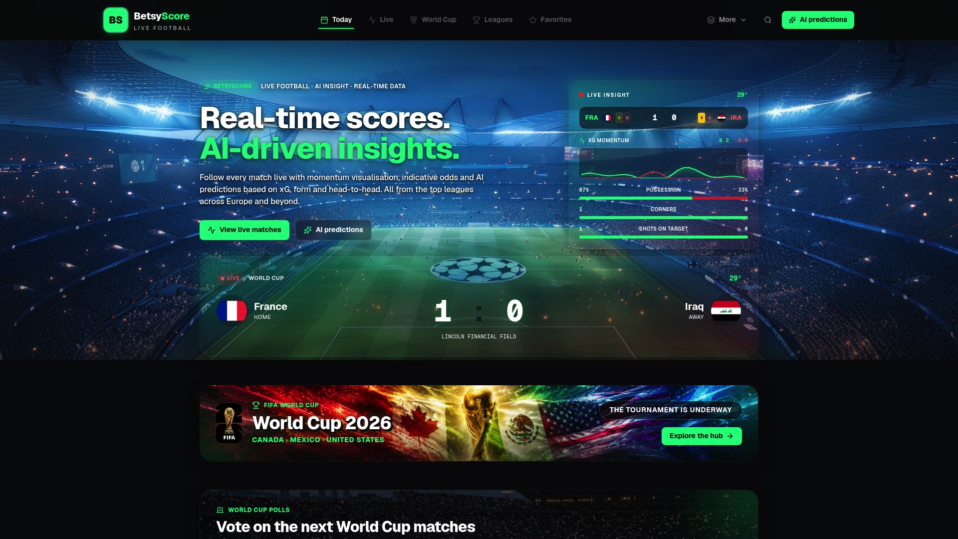
Coverage can span major football competitions, giving you live context to pair with any heatmap you study. Check the current AI predictions for an upcoming fixture and see how momentum and positioning line up in real time.
FAQ
How do you interpret a heatmap?
Start by identifying which zones show the most concentrated color, then check whether that concentration comes from events or raw positional tracking. Cross-reference any hot zone with video clips and filter by match phase before drawing a tactical conclusion.
Can ChatGPT create heatmaps?
A language model like ChatGPT cannot generate a heatmap on its own because it has no access to tracking or event coordinates from a match. It can help describe or summarize an existing heatmap image once the underlying positional data has been processed by dedicated analysis software.
How do I check a player’s heat map?
Most football data platforms display heatmaps on individual player profile pages, typically generated from either event or tracking data for a selected match or competition. Confirm which data type powers the map before comparing it across different players or games, since event and tracking maps can disagree.
What is a heatmap and how does it work?
A heatmap is a grid-based visualization that shades pitch zones by how much time or action a player recorded there, with warmer colors indicating higher concentration. It works by binning location or event coordinates into cells, then applying smoothing so the result reads as a continuous gradient rather than sharp blocks.
Sources
- Uefa
- Comparative research on pitch control and expected goals | IOPscience
- Heatmaps in soccer: event vs tracking datasets (arXiv)
- How do various positions cover distances? | FIFA Training Centre