How Football Club Crests Are Chosen: The Full Process
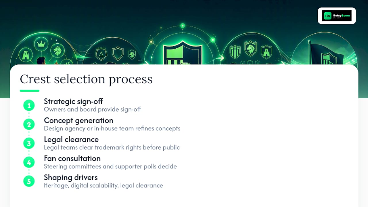
Football club crests are chosen through a structured process in which club owners and the board provide strategic sign-off, a design agency or in-house creative team generates and refines concepts, and legal teams clear trademark rights before anything goes public. Three drivers consistently shape the outcome: heritage and symbolism (what the club’s identity demands), commercial and digital scalability (what works on an app icon or embroidered kit), and legal clearance (what the club can actually own). Fan consultation, increasingly formalized through steering committees and independent supporter polls, determines whether a redesign earns legitimacy or triggers backlash. As Transform Magazine notes, a crest functions as a cultural artefact, and successful redesigns require emotional intelligence alongside rigorous stakeholder research.
Key Takeaways
A football club crest is chosen through a process that balances heritage preservation, digital scalability, and legal clearance, with fan consultation determining whether the outcome earns lasting legitimacy.
| Point | Details |
|---|---|
| Who signs off | Owners and board hold final authority; design agencies and legal teams execute the process. |
| Main constraints | Heritage symbolism, digital scalability to app-icon size, and USPTO trademark clearance. |
| Timeline | Minor refinements take weeks; a full redesign typically takes several months from brief to public launch, as detailed in case studies like Brentford. |
| Fan consultation | Steering committees, independent polls, and documented surveys are best practice. |
| Biggest risk | Removing sacred symbols without consultation, as Leeds United’s abandoned redesign demonstrated. |
Table of Contents
- Who actually decides how a football club crest is chosen?
- What is the step-by-step process clubs follow?
- What design principles shape every crest decision?
- How do commercial and digital demands shape the final crest?
- What are the governance and legal requirements for crest changes?
- Case studies: Norwich City, Brentford, and Leeds United
- How can fans and designers evaluate a proposed crest redesign?
- What is the difference between a club crest and a logo?
- What really matters when a club changes its crest?
- Why crest decisions matter to platforms like Betsyscore
- Sources
- FAQ
Who actually decides how a football club crest is chosen?
Decision-making authority is distributed across several layers, each with a different kind of influence.
- Owners and club board: Hold final strategic and commercial sign-off. They set the brief’s ambition level and approve the final mark.
- Executive leadership (CEO, commercial director): Build the business case, define budget, and align the redesign with sponsorship and licensing obligations.
- Design agency or in-house creative team: Generate concepts, run hundreds of iterations, and solve technical problems like scalability and embroidery legibility.
- Supporter groups and trusts: Provide consultation legitimacy. Without their visible involvement, any redesign risks a public revolt.
- Club legends, staff, and players: Act as symbolic advisors who signal which elements carry emotional weight.
- Governing bodies and legal teams: Apply regulatory and trademark checks. The Football Association’s consultation expectations in England serve as a widely cited governance benchmark for how formal this process should be.
Pro Tip: Supporter trusts are not just a PR courtesy. Clubs that document trust involvement with survey data and steering committee minutes have a defensible record if the redesign faces legal or reputational challenge.
What is the step-by-step process clubs follow?
A full crest redesign typically moves through seven stages, though the depth of each varies with the scope of change.
- Briefing and objectives: The board and commercial team define what the new crest must achieve, covering heritage preservation, digital performance, and licensing requirements.
- Historical research and brand archaeology: Designers audit every previous badge version, founding documents, and regional symbolism to identify which elements are culturally non-negotiable.
- Internal ideation and iteration: Agencies produce hundreds of internal concepts, including deliberately radical “what-if” versions designed to surface the elements fans will never accept losing.
- Fan and stakeholder consultation: Surveys, listening sessions, and steering committees gather representative feedback. Independent polls add credibility.
- Legal and trademark clearance: Every element is checked for conflicts in the relevant jurisdiction. In the United States, this means USPTO clearance before any public announcement.
- Production testing: Designers test the mark at embroidery scale, as a 16x16 pixel favicon, as a social media avatar, and in single-color reproduction.
- Phased rollout: Trial assets appear on digital channels first, followed by full merchandise deployment once production is confirmed.
Minor refinements can move through this sequence in weeks. A full redesign typically takes several months from brief to public launch.
Pro Tip: A staged digital reveal before merchandise production locks in allows clubs to absorb early fan reaction and make small adjustments without costly reprints.
What design principles shape every crest decision?
Every crest proposal is evaluated against five core criteria.
- Shape: Shields remain the dominant form globally, with roundels and monograms used for secondary marks and app icons. Regional traditions influence the choice, with Latin American clubs favoring circular forms and English clubs typically retaining the shield.
- Primary symbol: Animals, local landmarks, and founding monograms carry the most heritage weight. Designers treat these as the crest’s anchor.
- Color palette: Clubs rarely change primary colors because merchandise, broadcast graphics, and stadium infrastructure are built around them.
- Typography: Custom lettering distinguishes a crest from generic stock marks. Single-color variants of the type must remain legible at small sizes.
- Scalability: Fine detail that reads well at 10 cm on a shirt disappears at favicon scale. Technical constraints like embroidery and single-color reproduction often drive decisions that look purely stylistic.
The dominant tension in contemporary crest design sits between visual reembedding and mid-2010s minimalism. Abertay University’s research documents clubs reinstating heritage-rich crests as a strategic act to restore institutional identity after minimalist redesigns alienated supporters. Norwich City’s redesign by agency SomeOne is a precise example: the club kept its canary, ball, and castle but corrected uneven line weights and recentered the ball for better digital reproduction.
Pro Tip: Custom type and a defined single-color variant are the two elements most often omitted from early concepts and most expensive to retrofit later. Build them into the brief from day one.
How do commercial and digital demands shape the final crest?
BBC reporting and commentary from football finance expert Kieran Maguire confirms that commercial and digital branding pressures are among the primary drivers of crest simplification. The practical reasons are concrete.
- Merchandise production costs: Simpler marks reduce embroidery thread counts and screen-printing complexity, lowering per-unit costs at scale.
- Digital-first requirements: App icons, favicons, and social media avatars require a clear, single-symbol option that reads at 32x32 pixels. Complex crests with multiple nested elements fail at this scale.
- Licensing and sub-branding: Women’s teams, academy sides, and stadium signage often require crest variations that must remain coherent with the primary mark.
- Sponsor and commercial partner requirements: Licensing agreements sometimes specify minimum clear-space and color-contrast standards that force simplification.
Western Sydney University research examines whether crests now function as corporate logos in the digital era, noting that the distinction between cultural emblem and commercial mark has narrowed significantly as clubs operate as global brands.
What are the governance and legal requirements for crest changes?
Fan consultation best practice centers on three mechanisms: steering committees with representative supporter demographics, independent polls conducted by a third party, and documented listening sessions with season-ticket holders. The FA’s consultation expectations in England provide a formal governance model, requiring clubs to demonstrate meaningful engagement before a material change is registered.
- U.S. trademark clearance: Any club operating in the United States or selling merchandise here must clear the proposed mark through the USPTO before public launch. This includes word marks, device marks, and color combinations.
- Material change threshold: Changes to primary color, text, or notable design features typically trigger a formal consultation requirement. Minor refinements to line weight or spacing generally do not.
- Legal checklist: Trademark clearance, contract updates with kit manufacturers, licensing clause reviews, and merchandising rights confirmation.
- Licensing agreements: Existing kit and merchandise contracts may contain approval clauses that give commercial partners a review window.
Pro Tip: A simple line-weight correction does not require an independent fan poll. A color change or symbol removal does. Knowing that boundary saves months of unnecessary process and prevents the appearance of consulting fans on decisions already made.
Case studies: Norwich City, Brentford, and Leeds United
Norwich City
SomeOne’s redesign for Norwich City is the clearest recent example of heritage-led finetuning. The agency ran extensive stakeholder engagement, including surveys and steering committee sessions, before touching a single element. The canary, the castle, and the ball remained. What changed were technical: uneven line weights were corrected, the ball was recentered, and the overall mark was optimized for digital reproduction. Early reactions were mixed, as they almost always are, but the documented consultation process gave the club a defensible rationale.
Brentford
Brentford’s redesign by agency Article ran for 18 months and focused on a single problem: the existing bee was too complex for digital and stadium applications. The team referenced historical badges from the 1960s to ground the simplified form in genuine heritage rather than pure modernization. The result was a bolder, cleaner bee that worked at every scale from stadium fascia to app icon.
Leeds United
Leeds United’s attempted redesign stands as the cautionary case. The proposed mark removed long-standing visual elements without adequate fan consultation, and the backlash was immediate and organized. Petitions and public pressure forced the club to abandon the redesign entirely. The lesson is direct: a technically competent crest that lacks fan legitimacy will not survive.
A failed redesign costs more than the agency fee. It costs trust, and trust takes years to rebuild.
Lessons across all three:
- Stakeholder process determines acceptability, not design quality alone.
- Technical legibility at small scale is non-negotiable.
- A clear, documented rationale reduces the intensity of negative reaction.
How can fans and designers evaluate a proposed crest redesign?
Evaluation checklist:
- Does the proposed mark preserve the club’s sacred symbols (primary animal, landmark, founding monogram)?
- Does it scale cleanly to a 32x32 pixel app icon without losing legibility?
- Does a single-color version work on white and on the primary kit color?
- Does the color palette respect the existing merchandise and broadcast infrastructure?
- Has trademark clearance been confirmed in all relevant jurisdictions?
- Is there documented evidence of fan consultation (survey data, steering committee minutes)?
Red flags to watch for:
- No public evidence of a consultation process.
- Removal of a symbol that has appeared on every badge version in the club’s history.
- A redesign announced without a design system or rationale document.
- Unresolved trademark conflicts in key markets.
When reviewing a proposal, ask the club for embroidered mockups at kit scale, a favicon render, and the independent poll report. If any of those three items are unavailable, the process is not complete.
What is the difference between a club crest and a logo?
The terms overlap in practice but describe different things in principle.
- Crest: A cultural artifact with heraldic roots, carrying symbolic meaning tied to place, history, and community. Its primary audience is the supporter.
- Logo: A commercial mark optimized for brand systems, licensing, and digital applications. Its primary audience is the consumer and the partner.
As Western Sydney University’s research frames it, the distinction between crest and logo has narrowed as clubs operate increasingly as global commercial brands.
Many clubs now maintain both: a full heritage crest for kits and official documents, and a simplified monogram or single-symbol mark used as an app icon, social avatar, and sub-brand identifier. The football logo design guidance from LogoDesign.net documents how regional traditions influence which form dominates, with English clubs more likely to retain the full crest as the primary mark.
What really matters when a club changes its crest?
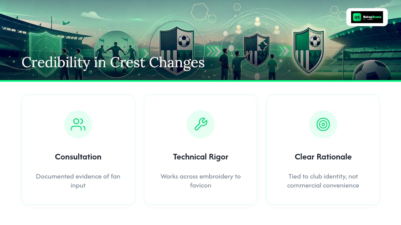
Credibility in a crest change comes from three things: meaningful consultation that produces documented evidence of fan input, technical rigor that confirms the mark works across every application from embroidery to favicon, and a clear rationale tied directly to club identity rather than commercial convenience. Fans invest in a crest at a level that goes well beyond brand preference. It appears on kits, in tattoos, and in the visual memory of every match they have watched. A club that treats that investment with care, as Norwich and Brentford did, earns acceptance even when the change is significant.
Why crest decisions matter to platforms like Betsyscore
At Betsyscore, club crests are not background decoration. Every live score update and AI-powered match prediction on the platform displays a club’s crest as the primary visual identifier, linking real-time data to the team identity fans recognize instantly. When a club changes its crest, that change ripples through every interface where the badge appears, from live lineups to tournament leaderboards. Understanding how football club crests are chosen matters to any platform that depends on consistent, recognizable club identity to deliver a clear fan experience.
Sources
- Design vs devotion: Why football club rebrands walk a finer line than most
- Beyond the badge: visual reembedding and the politics of football
- Why do football clubs change their crests?
- Kissing the badge: club crests or corporate logos?
- Norwich City crest redesign by SomeOne
- Football logo design guide
- You’re dealing with something people have tattooed: Norwich’s crest redesign
FAQ
Who has the final say on a new football club crest?
The club’s owners and board hold final approval authority. Design agencies, legal teams, and supporter groups all shape the process, but the board signs off on the final mark.
How long does a crest redesign typically take?
Minor technical refinements can be completed in weeks. A full consultative redesign, like Brentford’s process, typically runs several months from initial brief to public launch.
Why do some crest redesigns fail?
Redesigns fail most often when clubs remove long-standing symbols without adequate fan consultation. Leeds United’s abandoned redesign is the clearest recent example of how quickly organized backlash can force a reversal.
What is visual reembedding in football crest design?
Visual reembedding is the strategic reinstatement of heritage crest elements after a modernization attempt alienated supporters. Abertay University’s research identifies it as a deliberate act to restore institutional identity.
Do clubs need trademark clearance before changing a crest?
Yes. Any club selling merchandise in the United States must clear the proposed mark through the USPTO before public announcement. This covers word marks, device marks, and color combinations.